

Rating the Best Logo from Each NHL team.
- Brock Gorton

- Mar 11
- 5 min read
With the NHL season starting to wind down, it seems appropriate to look at the positives for each team. With the best logos every NHL team has ever had. Secondary logos will be included as an option, as for some teams, the secondary logos are better than the primary logos that NHL teams have used. Also, keep in mind these are, in my opinion, and we will be going in alphabetical order.

Anaheim Ducks current primary logo. Easily the strongest logo in Ducks history. Mixing the best of the original Mighty Ducks logo and the modern color scheme. With the addition of eyes on the mask. 8.5/10

Boston Bruins 2007/2025 secondary logo. While the Bruins have a rich history on the ice, the logos that have been used have been lacking. The Bruins love their iconic B logo; however, it is very plain. The old secondary logo, however, was strong enough to be a primary logo in my eyes. The Bruin is well-detailed and looks like it’s ready for a fight. 8/10

Buffalo Sabres 2022 reverse retro logo. This was a very difficult choice here, as the Sabres have some of my favorite NHL logos of all time. But this logo mixes the past and present perfectly. The Goathead logo of 96/06 is one of my favorite logos ever. When the Sabres rolled out their Reverse Retro jerseys in 2022, I loved them. 9/10

Calgary Flames Alternate Logo. This is the logo that got me into hockey. While the classic C is timeless, “The Firehorse” is the perfect meld of the history of Calgary with their hockey team that moved from Atlanta. 9/10

Carolina Hurricanes current alternate. No, I will not be including the Hartford Whalers logos, as I am sticking to the current franchises and their locations. While the primary logo for Carolina is nice, the logo speaks to me more as a logo. 7.5/10

Chicago Blackhawks current primary logo. To be fair, the logo has not had any major changes since 1957. The secondary logos can say the same thing. This isnt the last we will see a team with this. 5/10

Colorado Avalanche current alternate logo. Like with so many others on this list a great compromise between the past and present. With an homage to the old Colorado Rockies team of the 70’s. A blend unlike no other for a state and team like no other. 9/10

Columbus Blue Jackets current alternate logo. And now for something completely different. A logo that has a canon front and center. No notes 8.75/10

Dallas Stars 2020 reverse retro logo. The Stars' logo history, in my opinion, is very weak. Until 2013, it was the color scheme. After that, it was just plain ugly logos. So Lugi wins by doing nothing here, as it is the best looking of a pile of crap. 6.5/10

Detroit Red Wings logo. They have pretty much had just one logo in the history of the franchise. It helps when they knock it out of the park. 8.5/10

Edmonton Oilers current alternate logo. A throwback style logo done right. The Oil Rig in the middle is beautiful, and this should be the primary logo going forward. The Oilers got this absolutely right. 8.5/10

Florida Panthers alternate logo 2009/2012. A gem hidden away from my knowledge until I began the research for this article. This accomplishes what other teams wish they could today. A good, clean style throwback logo with a color scheme not used by the team. 8.75/10

Los Angeles Kings reverse retro logo 2022. Simple, classy, sharp, and classic. The Kings should have never abandoned these colors. 8.25/10

Minnesota Wild reverse retro logo 2022. The North Stars colors with the amazing logo of the Wild. 9.5/10
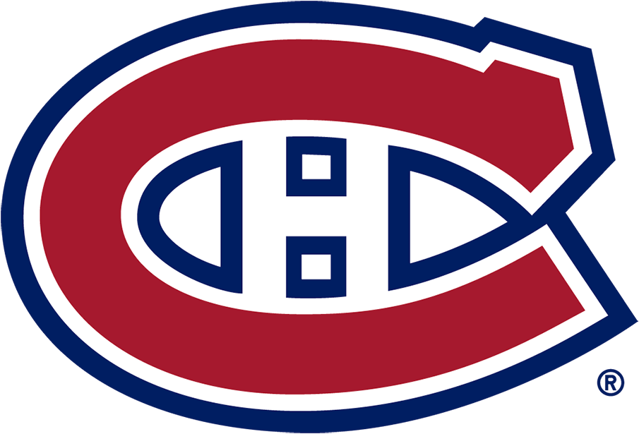
Montreal Canadiens current logo. Much like the Stars and Blackhawks, this was the best of a logo that I have despised for a long time. 4/10

Nashville Predators 2020 Winter Classic logo. When you are tasked with coming up with a classic logo for a team founded in 1998, it can be tough. This logo is tough in a different way. With the assignment given, Nashville made a logo that is better than half the league's primary logos. 9.25/10

New Jersey Devils 2022 reverse retro logo. There is a common theme here, if you can’t tell, and that is the 2022 reverse retro logos were incredible. The Devils got the old Kansas City Scouts and Colorado Rockies colors with their current logo. Which is a combo that shouldn’t work as well as it does. 8.5/10

New York Islanders 1995/1998 alternate logo. The Islanders have pretty much had the same logo for their entire history, except for when they lost their minds with the fisherman logo. However, the alternate logo they had during that time was fantastic, and if the NHL ever does another round of reverse retro jerseys, this should be what the Isles use. 7.5/10

New York Rangers 1996/2007 alternate logo. The best logo the Rangers have ever had, and they have put it in storage because it outshines anything else they’ve worn. 8/10

Ottawa Senators current logo. It’s hard to beat a classic. Even more so when this is the third version of said classic. 7.25/10

Philadelphia Flyers 2011 throwback logo. It’s honestly another tight race for this one, as once again, the logo has not changed much. This was the best of what was out there. 6/10

Pittsburgh Penguins 2008/2011 alternate logo. Throwback logo for the Winter Classic, the Pens met and raised the standard for Winter Classic logos. The Penguins are the reason that many teams have had to step up their game for throwbacks. 8.5/10

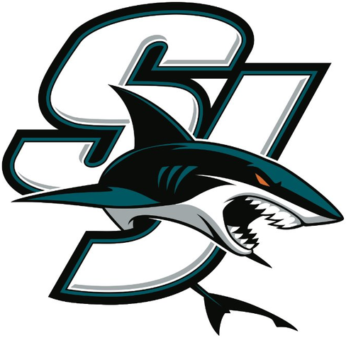

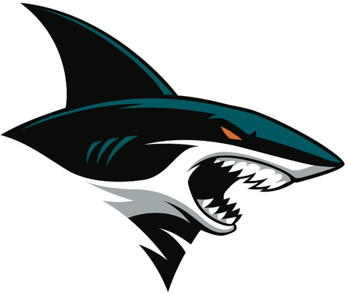
San Jose Sharks current alternate logos. Yes, all of these logos get the spot. All of these logos are spectacular and could be the primary logos for the Sharks. 8.75/10

Seattle Kraken current logo. For a team that is five years old, the Kraken started strong with their logo. As they have what, in my opinion, is the best primary NHL logo. Now is part of that because I am a fan of one of the Kraken’s farm teams? I mean, eh. 9.5/10

St. Louis Blues current alternate logo. While many find the Blues logo phenomenal, I find the alternate logo far better. While the note is the traditional mark of the Blues, this is a much better logo for the city of Saint Louis. 8.5/10

Tampa Bay Lightning 2007/2011 primary logo. While several people will say the simpler the better, the Lightning left a great logo on the side of the road. 8/10

Toronto Maple Leafs Saint Patricks logo. See Montreal, Chicago, Philly, and Boston. The one logo that goes outside the box is the best. 6/10

Utah Mammoth primary logo. The colors, the mascot, the details. If it wasn't for Seattle, the Mammoth would have the best logo in the NHL. Utah got a real winner with this logo. 9.25/10

Vancouver Canucks 1997/2007 primary logo. While many like the logo that this one replaced for me, the Canucks logo has always been better since the change, and the colors of the Canucks from 1997/2007 meshed perfectly with the Orca. 8/10

Vegas Golden Knights alternate logo. Almost ten years in, and the Knights have not been able to get a better logo than their secondary logo. Which is good and bad. 7/10

Washington Capitals third jersey/2021 reverse retro logo. Do I need to explain why this is such a good logo? 9/10

Winnipeg Jets current logo. For a team that has been in the league since 2011, the Jets have kept the same logos since moving from Atlanta, and it doesn’t need to change anytime soon. The Jets came into the league with the strongest logo in the league at the time. 8.75/10


Comments